
|
|
| weblog/wEssays archives | home | |
|
The "Record" Dow Jones Industrials--A Clear-Eyed Look (October 21, 2006) The DJIA--Dow Jones Industrial Average--has just hit a new record. Of its 30 constituent companies representing diverse range of industries, how many do you reckon are hitting new highs? 28? Nope. 23? Not even close. 15? Try 7. Frequent contributor Harun I. recently alerted me to the extremely narrow breadth of this great Dow advance--only 7 of the Dow 30 stocks have reached new highs. This is troubling for anyone with a grasp of stock market history. The great Nasdaq Tech bubble of 1998-2000 was also extremely narrowly based, drawing the vast majority of its stratospheric rise from only 36 large-cap stocks such as Microsoft and Cisco Systems. Common sense, as well as stock market history, suggests any index advance which is based solely on a handful of companies is extremely vulnerable to collapse--which is just what happened as the Nasdaq fell from over 5,000 to 1,100 in less than three years. Even as the Nasdaq reached new heights, hundreds of companies within the index languished near their lows. Analysts who pointed this out were deemed Cassandras and widely mocked for not getting it, "because this time it's different." And here we go again, with an index hitting new highs based on only 22% of its constituent stocks. Harun also pointed out that according to classic Dow Theory, the Transport Index must also hit new highs to confirm the sustainability of the Dow advance. Alas, the transports are not hitting new highs--a red flag to adherents of Dow Theory. Here are eight Dow component charts, drawn from a number of industries. (Harun very generously assembled charts of all 30 DJIA stocks into a PDF which you can view by clicking here or download by right-clicking the link.) Take a quick look and see if you notice anything about these eight stocks: 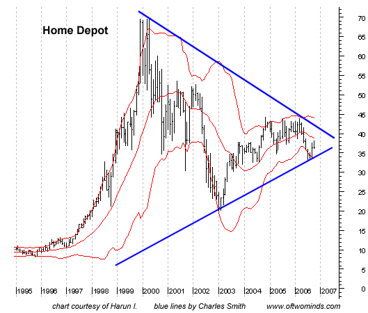
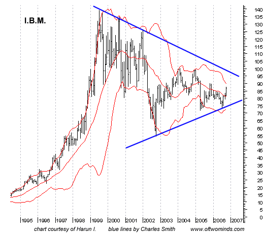
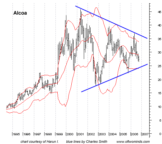
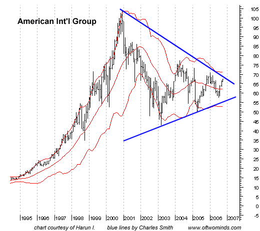
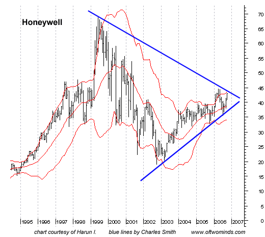
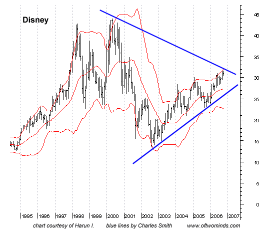
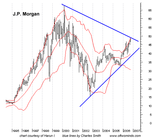
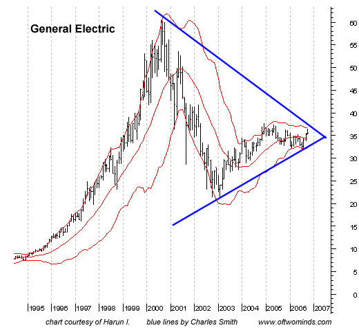
Do you see how far below their highs these stocks are? Do you note the number of giant, multi-year wedges in these charts? That should be very perturbing to anyone bullish on the Dow and indeed the U.S. economy. As I have pointed out here many times, wedges tend to break way up or way down--usually down. To be bullish on the Dow, you would have to believe that every one of these companies is poised for blow-out growth in sales and profits, enough to drive their stock prices upwards toward their previous highs. As noted here before, corporate profits are already at multi-decade highs, so to expect these companies to break out of multi-year wedges is asking quite a lot. A more clear-eyed view is that these charts reveal a Dow on the precipice of a massive breakdown. If, as many expect, the economy slips into a recession triggered by the downturn in housing, then it would only be rational to expect these stocks to break down rather than up. The narrow breadth of the new index highs and the large number of stocks on the verge of breaking down should give investors pause. The cheerleaders like to shout, "Go team, go, yea, new Dow record!" but do they ask you to look at the charts? No, because those are sobering, if not outright frightening. For more on this subject and a wide array of other topics, please visit my weblog. copyright © 2006 Charles Hugh Smith. All rights reserved in all media. I would be honored if you linked this wEssay to your site, or printed a copy for your own use. |
||
| weblog/wEssays | home |