As the "Prosperity" Tide Recedes, the Ugly Reality of Wealth Inequality Is Exposed
September 18, 2015
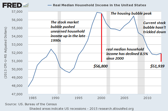
This chart of median household income illustrates why so many of us feel poorer-- we are poorer in terms of the purchasing power of our income.
A rising tide raises all boats, from rowboats to yachts--this is the narrative of "prosperity."
A rising tide is also the political cover for rising inequality: if the guy in the rowboat makes $100 more a month, he feels like he's participating in the prosperity.
Meanwhile, the guy in the speedboat is making $1,000 more a month and the guy in the yacht is making $1 million more a month.
But this doesn't bother the guy in the rowboat, for two reasons:
1. He thinks of himself as a guy who is currently in a rowboat on his way to buying a speedboat
2. Studies have found that our sense of wealth and "falling behind" is not defined by our actual increases in income or wealth, but by how we're doing relative to our peer group. If everyone else in rowboats is making $200 more a month in the rising tide of prosperity, the guy making only $100 more feels like he's falling behind--even if his absolute income and wealth is rising.
Conversely, if his peers are all suffering declines in income while his income is holding steady, he feels like he's doing pretty well for himself, even though his income is stagnant.
The fact that the wealthy are gaining far more in "prosperity" in both absolute and relative terms doesn't bother him as long as he's doing as well or better as his peers and feels he has a chance to eventually move up from a rowboat to a speedboat.
But when the tide of "prosperity" (i.e. the fake prosperity of financialization and phony statistics) recedes, the ugly realities of massive wealth/income inequality are exposed for all to see. The guy in the rowboat starts wondering if he can ever move up to a speedboat, and then he starts noticing the guy with the yacht just moved up to a much grander yacht while the paint is flaking off his rowboat.
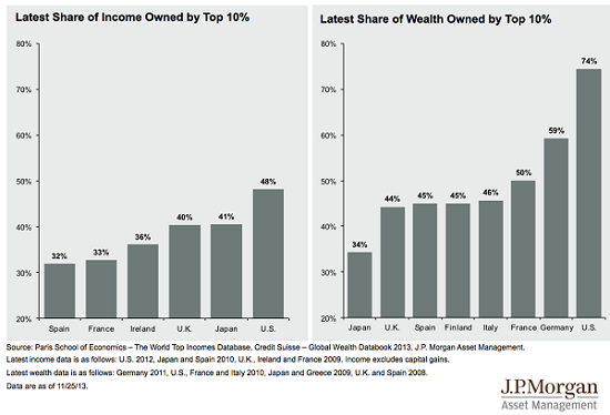
Let's look at some charts for context.
Wealth/income inequality is significantly higher in the U.S. than in other developed nations.
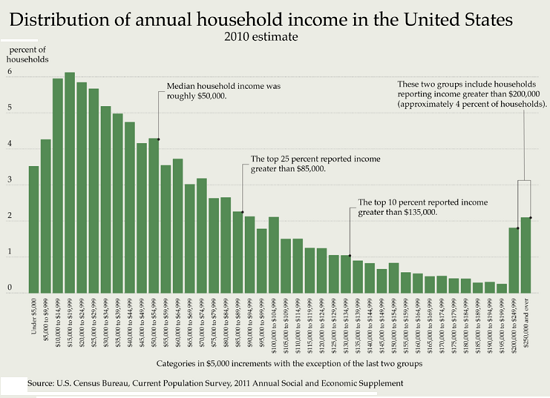
This chart shows the number of people earning each bracket of income. Half of all households in the U.S. earn less than $53,000 annually, and 75% earn less than $85,000. (These numbers are from 2010; 2012/2013 numbers are slightly higher.)
You can identify your own relative status with this interactive link: What Percent Are You?
This chart of mean (average) household income shows the income of each segment to scale.

This chart of median household income illustrates why so many of us feel poorer-- we are poorer in terms of the purchasing power of our income.
The acceptance of the multitude in rowboats for the few buying new yachts wears thin when the many sense their declining mobility and purchasing power. The illusion that the tide of "prosperity" is lifting all boats is dissipating into a mist that no longer offers cover to obscenely wealthy politicos disclaiming the ugly reality of rising wealth/income inequality.
The question for the chattering classes is this: will the bread and circuses of sports, random shootings, Trump and the rest of the churn in the media arena be enough to distract those stuck in leaky rowboats from the political fund-raising parties on the grandiose yachts?
NOTE: Contributions/subscriptions are acknowledged in the order received. Your name and email remain confidential and will not be given to any other individual, company or agency.
|
Thank you, Bryan M. ($50), for your splendidly generous contribution to this site -- I am greatly honored by your support and readership. |
Thank you, Jeffrey S. ($5/month), for your most generous subscription to this site -- I am greatly honored by your support and readership. |