
|
|
| weblog/wEssays | home | |
|
Welcome to 1935 (September 7, 2005) As an aperitif for today's substantial offering, click on these two websites: Bureau of Labor Statistics Bureau of the Public Debt On the BLS website, select the "inflation calculator" link in the upper left column titled "Inflation & Consumer Spending." Now select the year "1987" in the calculator and plug in $100. Click the button and voila, you find it takes $172 today to buy what $100 bought in 1987. Okay, now go to the Bureau of Public Debt and note that as of September 30, 1987, the Federal Deficit was $2.35 trillion. Next, note that the debt as of today is $7.94 trillion. Now multiply the 1987 debt ($2.35 trillion) by 1.72 to adjust the debt into current dollars: voila, $4 trillion. In other words, if the debt had risen only with inflation, it should be around $4 trillion, not $8 trillion. Doesn't the fact that our government has borrowed $4 trillion over and above inflation in the past "low-inflation" 18 years strike you as somewhat troubling? After all, one trillion here, one trillion there, and pretty soon you're talking real money. Now for the main course: a chart comparing the Dow Jones Industrial Average and the Nasdaq from their respective pre-collapse highs in 1929 and 2000. To avoid a confusion of dates, the timeline is measured in days from the peak rather than years. The vertical axis measures the two stock indices' decline from their highs by percentage. Thus we see that by some uncanny coincidence both the Dow and the Nasdaq rose to about 45% of their pre-collapse highs at the same time--2000 days after the highs, right about now for us in 2005 and right about April 1935 for the previous generation of "investors." 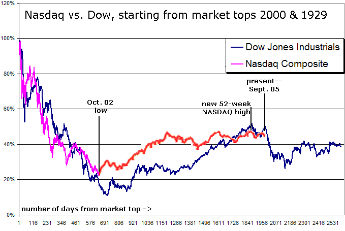
The present status of the Nasdaq is roughly analogous to April 1935, when, we note, the Dow took a major cliff-dive. Chartists have long observed that the stock market tends to form patterns which repeat over the years, decades and even centuries; they do not see coincidence in the close correlation of these two lines but repetition of an underlying pattern: a mania bubble which bursts dramatically, setting up a more leisurely "echo" of the bubble--where we are today--which is followed by a collapse of the "echo" boom. The overlay rather persuasively suggests that the deflation of the echo boom is close at hand. For an explanation for why the Nasdaq recovered more quickly than the Dow, look no further that the extraordinary dumping of low-interest cash into the economy which began in 2001. The Fed poured trillions of new dollars into the money supply in the past four years, something which did not occur in the early 30s. Despite this largesse, we find ourselves at exactly the same point 5.5 years out from the peak--on the edge of a secondary cliff. Okay, so you don't believe overlaying charts has any predictive value. Well, how about the statistic that bull runs historically average about 30 months in duration? We are now at month 35 in the current run up from the low set in October 2002. If that doesn't give you pause, then allow me to usher you to the Permanent Bulls Table over in the corner, where the banter today is all about how resilient the U.S. economy is in the face of fearsome energy cost increases. The table is thronged with excited traders today, but check back in December; the crowd--and its ebullience--may have noticeably thinned by then. * * * copyright © 2005 Charles Hugh Smith. All rights reserved in all media. I would be honored if you linked this wEssay to your site, or printed a copy for your own use. * * * |
||
| weblog/wEssays | home |