
|
|
| weblog/wEssays | home | |
|
Stock Market Tea Leaves (October 31, 2005) 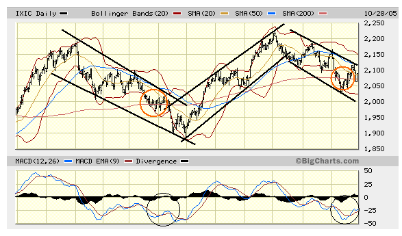
There are two schools of analysis in the stock market: fundamental, which looks at earnings and the prospects for higher profits, and technical, which examines historical charts and patterns for clues on the market's future direction. Here is a brief tutorial on technical analysis, using a chart of the Nasdaq from 10/28/05. It's been the contention of many, including myself, that the fundamentals of the nation's economy are shaky: that high energy costs, profligate borrowing and the housing bubble have laid the foundation for a recession which will take hold with jagged claws in 2006. On the other side of the ledger, analysts are touting the incredible growth of corporate profits--double-digit growth for 14 consecutive quarters! Don't you wish your paycheck went up 15%, quarter after quarter? How do they do that? They also contend housing is not in a bubble, and that unemployment is low, the GDP is rising and the consumer has lots of cash and borrowing power to fuel another 14 quarters of staggering corporate profit growth. Skeptics suggest that corporate profits will someday have to slow, that much of that profit is accounting tricks, the GDP is growing only because inflation is rising, and that the housing bubble is topping as we speak, ending the main driver of this "recovery," "the house as a big ATM machine." So let's look at the charts. I've drawn what are known as channels in T.A. terms--lines which reflect the overall trend of the market. Currently the market is in a clear downtrend; optimists say it has just turned the corner and will start rising, just as it did in May of this year. T.A. folks say a trend changes when the market rises above or below the current channels. So far, there's no evidence the market has broken out of its downward trend. Entire bookshelves are filled with various charts and techniques for discerning patterns, and there are so many ways to chart the market that T.A. offers plenty of evidence for either a bull or bear argument. Still, it's worth looking at the MACD, which charts the "moving average convergence-divergence" as the lower set of lines. When the lines are below the zero line, note that the market declines; when they're above, the market is climbing. Note that the MACD is firmly entrenched in the lower territory. Another pattern chartists look for is the moving averages of the market, especially the 200-day moving average which is the thin red line on this graph. When the market is above its 200-day MA, it's on an uptrend; when it's below, it's in a downtrend. I've drawn red circles at the points where the market dropped down and hovered at its 200-day MA line. We are at such a point now. Will it drop below or shoot up in blissful euphoria? No one can say for certain, but the saying is, "the trend is your friend," and right now the trend is down. I don't have space here to mention the many other signs that all is not right in the stock market--an increasing number of new lows, a deteriorating Advance-Decline (A-D) line, or the fact that this bull market is historically long in tooth (most advances last about 30-36 months, and it's been 36 months since the last low in October 2002). The stock market historically makes its best bull moves in the period from November to May, so Wall Street is hungrily anticipating another year-end rally. (Oddly enough, no one seems to mention that the market's best run this year occurred precisely in the historically "slow" period, June through August.) If you look at the channels, it takes a wondrous crystal ball or a very blind faith to see a bull market in this chart. But only time will tell. * * * copyright © 2005 Charles Hugh Smith. All rights reserved in all media. I would be honored if you linked this wEssay to your site, or printed a copy for your own use. * * * |
||
| weblog/wEssays | home |