
|
|
| weblog/wEssays archives | home | |
|
Seeking Relative Outperformance (August 28, 2007) A common reader query here at OfTwoMinds is: what can I do to protect myself financially from the coming unraveling? There is no easy answer, of course, for many reasons. One, I am not qualified nor prepared to offer investment advice of any kind. Two, if I were foolish enough to advise buying XYZ today, tomorrow it would be hit with news which caused it to crash, and three, the only person who can properly assess an investor's risk appetite, financial situation and investing style is the investor himself/herself. There is no shortcut to this financial self-knowledge. That said, there are some basic strategies which can be useful. One is "relative performance," described here by frequent contributor Harun I.: It has been my observation that the majority of people make investment decisions based on many things but no weight is given to the most important factor, that being whether the investment is increasing purchasing power. (emphasis added)So let's take the oil sector and see what we can make of it. We start with a long-term chart of light crude oil with a relative-performance comparative to gold: 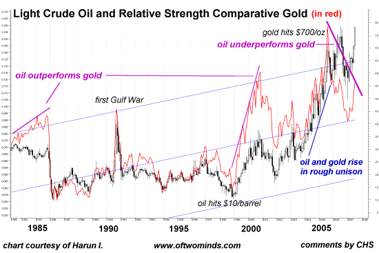
Harun's comment: "Where the red line is rising (1985 and 2000 peaks) oil was outperforming gold. From 2005-mid 2006 oil underperformed gold as noted by the decline of the red line." Next, let's look at a chart (courtesy of Harun) of an integrated oil/energy company, Exxon Mobil (ticker symbol XOM) plotted with relative-performance comparatives to the S&P 500 and gold: 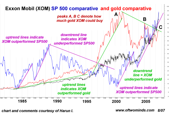
Harun provided this explanation: With Gold the denominator, when the red line is rising the numerator, which in this case is XOM, is outperforming Gold. When the red line is declining XOM is underperforming gold. The only significance of the red line being above or below price is the relative value (how much can be purchase with XOM), which is not to be confused with performance.Harun's summary: The measure of success of any investment is determined by the simple question, did purchasing power increase, decrease or remain unchanged?So what conclusions can we draw from plotting the relative performance of the broad stock market (S&P 500), gold against a leading oil/energy blue chip company? Any investment performance must ultimately be measured not just against alternative investments but in terms of purchasing power. These charts also suggest three other insights. 1. An investment may appear to be "doing OK," i.e. rising in nominal dollars, but meanwhile it is seriously underperforming other asset classes. 2. An asset may outperform for a period of time, and then underperform. "Buy and hold forever" may not be a successful strategy for establishing and maintaining outperformance. 3. Diversification may be a good idea, but diversifying into asset classes which are outperforming other classes and maintaining or growing one's purchasing power is an even better idea. Thank you, Rod C., ($10) for your generous donation to this humble site. I am greatly honored by your support and readership. All contributors are listed below in acknowledgement of my gratitude. For more on this subject and a wide array of other topics, please visit my weblog. copyright © 2007 Charles Hugh Smith. All rights reserved in all media. I would be honored if you linked this wEssay to your site, or printed a copy for your own use. |
||
| weblog/wEssays | home |