
|
|
| weblog/wEssays archives | home | |
|
After the Bubble: How Low Will It Go? (May 15, 2006) 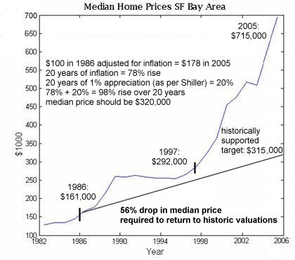 How low will housing go as the bubble bursts? For an answer, let's turn to
Irrational Exuberance
How low will housing go as the bubble bursts? For an answer, let's turn to
Irrational Exuberance
Shiller's book, which presciently predicted the collapse of the Nasdaq stock market in 2000 just weeks before that mighty bubble broke, has been re-issued with an analysis of the housing bubble. Shiller's key takeaway is that historically, housing in the U.S. rises, at best, at 1% per year not including the effects of inflation, that is, "real" appreciation. This chart depicts what history suggests will happen to housing prices: to return to this historically supported level, housing in the San Francisco Bay Area must drop 56%. Impossible! you gasp in dismay. They're not making any more land, the population is growing, etc. etc. etc., all the "common sense" reasons given for why housing is in a permanent uptrend. Funny, but that sounds just like the truisms given when tech stocks like PALM and SUNW were over $100, just before they began their long, slow agonizing decline to $5. The Internet did "change everything" and it continues to grow rapidly, but those realities did not translate into overpriced $100 per share stocks rising to $200, as widely predicted at the time. Why? There are two fundamental reasons why any bubble bursts: a statistical phenomenon called "reversion to the mean" and the deeply unprofitable nature of the bubble as a business is eventually revealed. Although reversion to the mean has technical definitions, for our purposes we can understand it as the law of averages; that is, a series of data will eventually revert back to the average. The farther it rises from the average, the higher the probability it will revert or return to historic averages. If the elk population explodes one season, for instance, then disease, overgrazing and a subsequent rise in predators all act to bring the elk population back down to historic norms. In the world of investing, the growth stocks of the 60s, labeled the "nifty 50," rose to great heights before falling back to earth once their price-earnings ratios rose to nose-bleed levels. In other words, the amount of money they were making simply didn't support the price of their stocks. For an explanation of reversion to the mean which relates to investment, visit the coffeehouse investor. Reversion to the mean is a statistical phenomenon, not an explanation. The underlying mechanisms for a reversion to the mean have been explored here in previous posts, and in many other sites: a veritable flood of cheap and easy money inflates the bubble, which inevitably deflates when loose lending standards are tightened and interest rates rise. Nothing fancy here; it's also called "the business cycle." Natural growth rises to excess when excessive liquidity gooses it, and then collapses when that liquidity is withdrawn or begins to cost real money. To borrow from Tolstoy: every healthy market is the same, but every bubble bursting is unique in its misery. There are plenty of absolutely bubblicious markets in the U.S. (and indeed, the world--check out Shanghai is you want a real fright), but I chose the one close to home: the San Francisco Bay Area. Shiller's analysis works on any bubble, anywhere, but obviously, the less dramatic the rise, then the less dramatic the decline. This chart provides a very clear picture of what a bubble looks like: a slow rise in values which suddenly turns up in a hockey-stick ascent to unsustainability. Note that the decade between 1986 and 1997 ended with housing values a bit above the historic line, but not by much. During all those years of flat-to-modest appreciation, the population was also growing, they weren't making any new land, etc. etc.--all the conditions were present which are trotted out to justify the bubble. Note that the hockey-stick rise began as the Nasdaq bubble created hundreds of billions in new wealth in the late 90s. Let's go over the numbers. According to the Bureau of Labor Statistics, $100 in 1986 equals $178 in today's (devalued) money. To that 78% rise due to inflation we add Shiller's 1% per year appreciation in "real" terms, which adds up to a historically supported value 98% above the 1986 median price of $161,000. In other words, a reversion to the historic mean will bring Bay Area median prices down from $715,000 to around $315,000--a decline of $400,000. This is the inescapable conclusion of Shiller's analysis and historical trends dating back to the 19th century. It cannot be denied; but you can of course retreat into denial. Sadly, that's what most investors did back in the dot-com heyday. As stocks tumbled, every brief uptick was embraced as the "bounce back" to the good old days, and every such bounce was a sucker's rally, leading only to further precipitous declines. For the median prices in Boston, Austin, Raleigh and the Bay Area, go to median housing price data from 1986 to to 2005 courtesy of the University of Texas. For more on this subject and a wide array of other topics, please visit my weblog. copyright © 2006 Charles Hugh Smith. All rights reserved in all media. I would be honored if you linked this wEssay to your site, or printed a copy for your own use. |
||
| weblog/wEssays | home |