
|
|
| weblog/wEssays archives | home | |
|
Changing Tides III: Reversal of Wealth (November 14, 2007) The Standard Line of standard-issue financial analysts is that the great stock, bond and real estate bubbles--oops, I mean Bull Markets--have enriched everyone. This is the essential underpinning to the claim that we live in an era of "Great Prosperity." Are there any reasons to be skeptical of this claim? Let's look at some charts. Based on data from the Wall Street Journal, most of the gains in the asset bubbles have accrued to the top 1%: 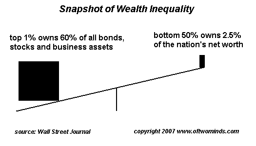
Roughly speaking, 90% of the wealth in the U.S. is owned by the top 10%. How dismissive of the bottom 40% is the financial media? Consider this excerpt from the latest issue of BusinessWeek: (11/19/07) 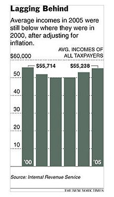
So far, the subprime mess is more of a human tragedy than a stopper for the economy. It's being felt most by the lower middle class, which isn't the driving force in economic growth. The bottom 40% of the population by income accounts for just 21% of consumer expenditures. Julia L. Coronado, a senior U.S. economist at Barclays Capital, says that in terms of spending power, and taking into account stock market gains, "Consumers haven't lost any wealth at all. In fact, consumers are better off than they were a year ago."Make less than $46,000 household income? You don't count. You've been written off. And Ms. Coronado parrots the Standard-Issue line perfectly: the "folks that count"--those in the upper 40% of wage owners and earners--are much wealthier now because of the stock market boom. Nice theory--but this seems to ignore the reality that the vast majority of the nation's wealth is owned by the top 1%, and most of the rest by the top 9%--not the top 40%. If we look at the chart on the right, we find that wages have been slipping for the past seven years--and that's using the government's horrendously understated /phony inflation numbers. If we calculated wages using real inflation (6-7%/year), wages have dropped considerably more than this chart suggests. Let's take a look at a long-term chart of the Dow Jones Industrial Average (DJIA), courtesy of frequent contributor Harun I., and explore the idea that we're all much richer because of the market boom. 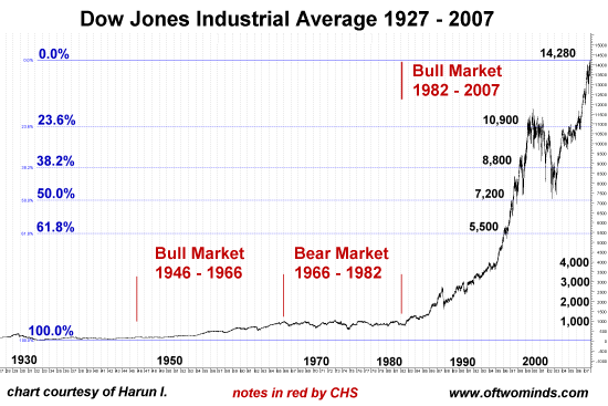
Just on first impression--this is obviously the chart of either a wildly inflated economy or a massive bubble of epic proportions--or maybe both. (On a technical note: the Fibonacci projections indicated on the chart were computed from the 1903 lows which were the same as the 1932 lows to the 2007 highs.) Does this chart look sustainable to you? Or should all those folks who are wealthy as a result of this amazing 25-year Bull market start looking for the exits? If this is an economy with high inflation boiling away just beneath the surface, we might want to recall what happened the last time inflation ignited: that would be the Bear Market of 1966-1982 which wiped out 2/3 of all stock value via high inflation. And if this is a massive stock market bubble, we might want to look at the Fibonacci projections to see where the market might retrace should the bubble deflate. Interestingly, the first Fibo, 10,900 is smack dab in the middle of the 2000 dot-com era high. Note that this level offered resistance and support in the 2004-2006 period. Notice how the DJIA swung between the next two Fibo projections, 8,800 and 7,200. In the 2002-2003 post dot-com Bear Interlude, the DJIA dropped down to 7,200, bounced back up to 8,800 and then double-bottomed near the 7,200 level before starting its ascent. Way down at 5,500, the market briefly wobbled there before continuing it's dot-com bubble ascent. In speculating about what might happen if this 25-year Bull Market reverses into an ebb tide /Bear Market, we could imagine a head-and-shoulders forming. The H&S is a standard pattern of technical analysis because markets tend to reach a "shoulder" or plateau of support and resistance, then break to new highs, after which they often return to the previous level of support--the first "shoulder"--thereby forming a second "shoulder." More often than not, they eventually break below the shoulder level and retrace to a lower level. Could we have seen the top of this 25-year Bull Market? If so, perhaps--and this is merely an opinion, not a prediction--the 2000 dot-com era high at 11,000 would become the right shoulder of a slow decline back to the 7,200 level: yes, a 50% drop from the top. So let's consider the standard financial analysts' favorite trope--that we're all so much wealthier now: 1. wages--down. 2. housing--down. 3. the stock market--maybe forming a massive, multi-year head-and-shoulders. Here's another question for those happy-happy cheerleaders of ever-rising DJIA and ever-rising wealth for everyone: exactly how long do Bull markets last? Forever? The answer seems to be: about 20 years, in the very best of times. Here we are at 25+ years, having already over-stayed our welcome in Bull territory by five years. And how long do Bear Tides tend to last? Looks like about 14 years. And so what happens to all that wonderful wealth everyone is always crowing about in the financial media in a 14-year Bear Market? Well, it recedes just like a tide, and people feel poorer because they are poorer. And not just us "written-off" lower-40% folks, but those folks at the top of the heap, too. Thank you, MV S., ($20), for your generous contribution to this humble site. I am greatly honored by your readership and support. All contributors are listed below in acknowledgement of my gratitude. For more on this subject and a wide array of other topics, please visit my weblog. copyright © 2007 Charles Hugh Smith. All rights reserved in all media. I would be honored if you linked this wEssay to your site, or printed a copy for your own use. |
||
| weblog/wEssays | home |