
|
|
| Readers Journal weblog/wEssays | home | |
|
Global Warming: Our Story So Far (Michael Goodfellow, June 26, 2007) I was talking to a 20-something friend the other day, griping about the lack of good science fiction these days. He laughed and said that we already had the Internet and robots running around on Mars, so who needed SF? I replied that SF is one of the ways we think about the future, our dreams about what we hope or fear will happen. He then said "Well, it doesn't matter much does it? We don't have much of a future, do we? The Earth is going to bite back." He then repeated most of the doom and gloom you hear regularly, about pollution, overpopulation, global warming. "Al Gore says we're all going to drown." Combine that with a cynicism about politics and you come to the conclusion that there are horrible problems and that we won't do anything about them. I argued against this, telling him that even the EPA says the air in the U.S. is cleaner than it's been in 30 years, that population trends are for a leveling off, not an explosion, and that there are lots of problems with the simple view of the global warming debate given in "An Inconvenient Truth." He just shrugged, waiting for the geezer (I'm 48) to wind down his rant. None of it penetrated. Frankly, the idea that a whole generation thinks the world is doomed scares me more than global warming. Like it or not, real or not, global warming is a huge problem for the world. Serious debate is going on about what to do, government action on this is already affecting us all, and will continue to do so. The potential effects of legislation on the world economy, the politics of trade and on our lifestyles are all huge. So it makes sense to follow this debate as closely as you follow any other big issue, from the housing bubble to the Iraq war. The problem, as usual, is getting some context and separating the facts from the political bias. If you like your meat red, go see "An Inconvenient Truth" then read a criticism here or watch the BBC documentary "The Great Global Warming Swindle" here (part 1 of 8) and read criticism of that nearly everywhere. If you want to be reassured that global warming is real and the "deniers" are all idiot oil company employees, go to www.realclimate.org. And if you want to be reassured that global warming scientists have all sold their integrity for research dollars, are ignoring contrary data, refusing to release methods and results, and even faking data, go to www.climateaudit.org. For a thorough and interesting summary of the anti-warming arguments, go to a paper by Zbigniew Jaworowski and skip to page 4 ("The Truth About Ice Cores"), after the pages of abuse heaped on the global warming community. For a more polite (Canadian National Post) review of global warming "deniers", go here. Fun, fun, fun! The rest of this article is my attempt to summarize the debate as I understand it. The History of Climate Let's start with the big picture. This graph is a reconstruction of the Earth's temperature for the last 500 million years (from here). As with the rest of these graphs, read them from right to left. The left edge, at zero, is the present. 
As you can see, the temperature of the Earth has bounced around a lot. We are currently (left side) in a cold spell, the coldest the Earth has been in 450 million years. Zooming in on the last 65 million years, you can see more detail (from here): 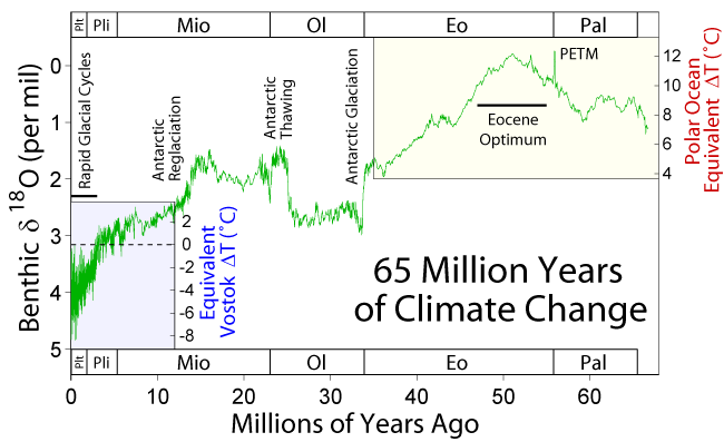
Again, the left side is the present, and right is 65 million years ago. As you can see, the temperature was higher 50 million years ago (the Eocene Optimum), and with a bit of wobbling around, has been steadily cooling. The whole period from 40 million years ago is described as an "ice age." Zoom in on the last 5 million years (from here) and you start to see some short-term cycles. 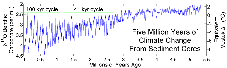
This graph is very jagged! The temperature is swinging by several degrees each 100,000 years. Remember the left side is the present and is the coldest part of the graph. The zero line (right-side scale) is the current temperature. The Earth has spent almost all of the last 2.5 million years colder than it is now. Let's zoom in again to the last 450,000 years (from here.) 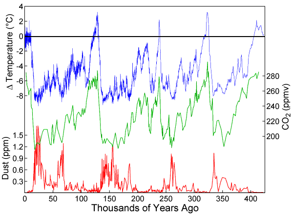
This one has three datasets � temperature in blue, CO2 in green, and dust in red. Again, the present is on the left. The black line at zero represents current temperature (top-left scale.) This is data from the Vostok ice cores and is the same data used by Al Gore in "An Inconvenient Truth." Notice several things about this graph. The Earth spends nearly all of its time colder than we are now. In fact, if you were describing this to someone, you'd say that the Earth is normally several degrees colder, and every 100,000 years or so, it spikes up to a bit warmer than we are now for a few thousand years, then goes cold again. And in fact, science calls the current period an "interglacial", a temporary gap in the long ice age. The second thing you might notice is that we've already had a long warm stretch (around 10,000 years), and the next move for the climate would be colder. Much colder. Lastly there's the famous CO2 line (in green), which almost matches the temperature line. Clearly, there's a link between the two! For Al Gore, it's that CO2 causes a temperature increase. For the deniers, it's the other way around. More research has shown that the temperature change precedes the CO2 change by a few hundred years. The obvious question for the pro-warming people is "what causes CO2 to increase naturally (back before there were any humans to burn fossil fuels?)" The obvious question for the deniers is "what causes temperature to rise naturally?" The problem of CO2 increase after temperature increase is mentioned on RealClimate (the pro-warming site), and basically dismissed (see here.) Their point is that it's a feedback loop, where increased temperatures release CO2 from the oceans which then further increase temperatures. It's not clear to me why this cycle stops, or what gets it started in the first place. At the end of this item, RealClimate states that CO2 may have reached levels of 1000 parts per million (ppm) -- perhaps much higher -- at times in the distant geological past (e.g. the Eocene, about 55 million years ago).This is worth keeping in mind � the current CO2 levels are high (the highest on this graph of the last 450,000 years), but not unprecedented. Nature can produce numbers this high on its own. And although the Earth was much hotter then, it was not a runaway greenhouse effect that flooded the world or turned it into a second Venus. What I notice about all these graphs is how noisy they are. If these are accurate, there are huge swings in the Earth's climate, even over short periods. It would be very hard to tell if any change is natural or man-made. After all, in this last graph, a single pixel is still hundreds of years. A swing upwards of 1 or 2 degrees would be lost in that noise. If you were looking at it from a million year context, everything that has happened in the last 50 years would be an irrelevant little blip. Let's zoom in again, to the last 12,000 years. This graph shows eight temperature lines representing different reconstructions, and the average (from here.) 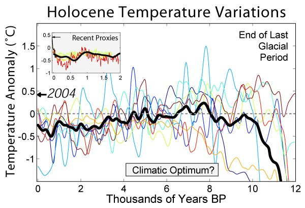
You start to see where all the disagreement comes in. Each line (each different "proxy" for measuring past temperature) gives a fairly different picture. In the average, you see a gradual cooling from a peak 8000 years ago to the present. Finally, let's see the last 2000 years (from here.) 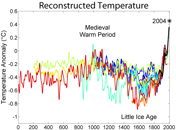
This graph is read from left to right (2000 on the right is present time.) This is the first graph where we can start to get independent measures from historical records. We can ask about the Roman cultivation of grapes in England, the Viking directions to Greenland that don't mention ice, or the Thames river freezing over (as it's shown in paintings.) We can start to compare with long-running temperature records like the ones kept by the British Navy. Unfortunately, there is still no agreement. This shows 11 different reconstructions of past climate. Note how much they vary from one another, and how much temperature varies from time to time. You do see that 1000 years ago, temperatures were also high, about the same as today (and colder than 8000 years ago, from the previous graph.) The increase in temperature from 1600 looks dramatic, but of course, nothing but the 20th century numbers could really be blamed on industrialization and burning fossil fuels. If you took the graph from 1900 only, it would look like a dramatic increase, but in the context of the last 2000 years, it looks more like a continuation of an existing trend. The "deniers" simply call this the end of the "Little Ice Age". Background Summary No one doubts that CO2 is a greenhouse gas, along with methane, nitrous oxide, and ozone. But also no one doubts that water vapor (especially as clouds) is the most significant greenhouse gas. In fact, without its atmosphere, the average temperature of the Earth would be considerably colder. No one doubts that climate is extremely variable, as is CO2 concentration. As the graphs above show, the average temperature has swung several degrees in each direction, from very hot millions of years ago, to very cold during the last ice age, just ended 10,000 years ago. The recent history of the Earth is a series of ice ages interrupted by warm periods. Without some effect from human activity, the climate will almost certainly return to an ice age, its normal state for millions of years. This variability is seen on all time scales � 100 million years, 1 million years, 100,000 years, 1000 years and even over decades. The climate warmed up to 1940 or so, cooled again to 1970, then warmed again to the present. The long-term variations in climate are thought to be due to changes in the Earth's orbit (see Milankovitch cycles), but there are apparently problems with this theory. The 100,000 year climate cycle is much stronger than would be predicted. Also, it seems to have been a 41,000 year cycle back a million years ago, and there's no obvious reason that the orbital factors should have changed abruptly. The shorter-term variations are blamed on everything from changes in solar activity to continental drift to volcanic activity, all amplified by CO2 and other greenhouse gases. From what I've read, this is all a very unsettled part of climate science. Finally, I don't think anyone doubts that it would be great to have better data. In fact, one criticism of global warming research is that they aren't spending enough money to get this data. There should be a concerted effort to put together a really solid record of past temperatures, using many different proxies (things like fossil tree rings or pollen counts) from many different parts of the world. Any historical records (like crop yields or river levels) that can shed light on this should also be collected and correlated. My impression from the debate is that we are spending a lot more on computer models than on the data that goes into them. The three most common theories of what's going on now are:
The modern global warming theory is basically the following:
1. There is an increase in CO2. According to some researchers (see the discussion in Jaworowski) the ice core data isn't reliable. There are chemical processes that can change the amount of CO2 held, and there is debate on the lag between when the ice is formed and when the CO2 is finally captured. He says the ice core CO2 measurements don't agree completely with other proxies. Also that the levels of CO2 in the atmosphere have been measured by chemists since 1812 and don't agree with reconstructed measurements. A sample paragraph: This is the reason that between 1880 and 1940, when the global average temperature warmed up by about 0.5�C, the direct measurements in the atmosphere registered a very large increase of CO2, from about 290 ppmv in 1885 up to 440 ppmv in 1940�about 60 ppmv higher than now (Beck 2007).2. The increase is due to the burning of fossil fuels. If CO2 is varying naturally, you would have to separate this component from the output of industry to get a true measure of CO2 increase due to humans. 3. There is an increase in temperature. There is considerable debate about this too. Satellite measurements don't go back far enough to give much history. Weather stations have measured the temperature for over 100 years, but there's concern that as cities have grown up around them, the "heat island" effect has biased the temperatures upwards. See https://www.surfacestations.org/, which claims that rural stations with properly maintained facilities show no increase in temperatures, whereas urban stations or ones with lots of nearby development show increases. And the farther we go back, the more problematic it becomes. Before weather records, we must estimate temperature from proxies, and data becomes very uncertain again. The methods used to manipulate the data and correlate various different sequences are also an issue. The infamous IPCC "hockey stick" graph which showed temperatures skyrocketing after 1950 turned out to be an artifact of the way the data was processed. 4. The temperature increase is due to the CO2 increase. Again, there's a range of opinion about this. CO2 should increase temperature, but it's only one factor. Increase in temperature should also release more CO2 from the oceans, so cause and effect is hard to figure (or it may be both � a feedback loop where temperature increases CO2 which increases temperature.) The competing theory is that the sun is driving all the recent increases in temperature, and that is driving the increase in CO2. 5. CO2 will continue to increase due to economic growth. The Peak Oil idea implies that there isn't enough oil to keep the CO2 output increasing for 100 years. Other technologies like gasification of coal or recovery of oil from tar sands aren't going to substitute. Economists have said that the IPCC climate models are very na�ve about economic growth, simply assuming that every country in the world will continue to grow at high rates. This leads to a model of the year 2100 where a billion Chinese own an SUV getting 12 mpg. And of course, no new technologies are assumed. Is this reasonable? 6. Computer models say the temperature will get a lot higher, with disastrous effects. Everyone admits that the computer models are incomplete. They don't have fine enough resolution, they don't model clouds well, and there are all kinds of external factors that just have to be fudged in the model, not derived from a basic understanding of the atmosphere. You can't model everything! There are aspects of the air, oceans, soil, and ecology you have to just measure and then plug into the model as constants ("external variables.") And as mentioned above, you have to make a lot of assumptions about the economy too. If your economic prediction for the next 100 years is worthless, so is your climate model. And in my opinion, there are more fundamental problems with modeling the climate. For one, there's no track record that can be used to validate the models. They just haven't been around long enough. Getting one version of the model to retroactively predict the past 100 years doesn't tell you much. It could just have the right fudge factors to make it come out right. What you want is something that keeps making accurate predictions into the future. Unfortunately, this is impossible. There will always be unpredictable events, from volcanoes to variations in solar output, that throw off the model. Given how complex the system is and how coarse the models are, you are never going to make an exact prediction of a single year. The model could only be tested against a long range of years, showing that the model had the trends right, not the specific weather. But this takes decades of comparing the model to the actual (future) weather. If global warming is a disaster in progress, by the time you trust the model, it's too late. Another problem is that none of these models even attempt to capture the long-term climate cycles. Any recovery from the "Little Ice Age", let alone something driven by the larger 100,000 year cycle, is just a constant to the model. And that means it's an assumption that can't be tested. A really good model of climate should be able to take data from many previous periods and accurately predict the subsequent climate. Not just the last 100 years, but the weather 1000 or 2000 or 10,000 years ago, given the conditions at the start of that period. But, you can't do that either, since we don't have good enough data on previous periods. You'd want measurements of the atmosphere and oceans at thousands of points around the globe. Instead, we have a handful of data points. Solar Cycles and Other Natural Causes We know there are larger forces outside the atmosphere that affect the Earth's climate. The Earth and Sun are moving through the galaxy, exposed to different environments as the solar system orbits the galactic core, over a period of 225-250 million years. The eccentricity of the Earth's orbit (difference from a perfect circle) changes over a 100,000 year period. The tilt of the Earth on its axis varies over 41,000 years, from 21.5 degrees to 24.5 degrees. The axis of the Earth changes direction, undergoing precession (see here) over 26,000 years. All of these change the amount of sunlight received, and the timing of the seasons. The 100,000 year and 41,000 year periods in these orbital changes certainly correspond to similar periods seen in the climate data (see the 5 million year graph above.) It's certainly not a stretch to think that the Sun has something to do with climate! The output of the Sun itself varies. On an 11-year "Schwabe Cycle", the number of sunspots varies. They also vary over longer periods, a 75-90-year "Gleissberg Cycle," a 200-500-year "Suess Cycle" and a 1,100-1,500-year "Bond Cycle." In the National Post article here, R. Timothy Patterson says that a close correlation between the output of the Sun and climate is seen: Our finding of a direct correlation between variations in the brightness of the sun and earthly climate indicators (called "proxies") is not unique. Hundreds of other studies, using proxies from tree rings in Russia's Kola Peninsula to water levels of the Nile, show exactly the same thing: The sun appears to drive climate change.Sunspots have been counted continuously since around 1749, with earlier data points to 1610. Before that, carbon-14 levels can be used as a proxy for solar activity. The last 1100 years are shown below (from here.) 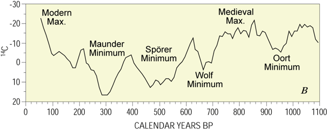
You can compare this data with the 2000 year temperature graph above (which unfortunately runs the other direction.) Around 1000 AD the peak of the Medieval Warm Period, you have a maximum in solar activity. Similarly, the modern warm spell also corresponds to a peak. The Little Ice Age on the other hand, lines up with a minimum of activity. The brightness of the sun doesn't vary enough to cause these effects on temperature, so until recently, there was no mechanism that would explain this. However, it was shown in a laboratory experiment that cosmic rays could affect cloud formation. If I understand correctly, an increase in solar activity increases the Sun's solar wind, which shields the Earth from cosmic rays. This in turn means fewer clouds form, allowing more sunlight to reach the ground. In times when solar activity is low, the reverse happens, and more clouds are formed, resulting in less sunlight. This is the "deniers" answer to the current change in climate. The sun is more active than it has been in 8000 years. This is heating the Earth. The CO2 increase results from the oceans releasing the gas as they warm. Human-produced CO2 is a minor factor. There are some reports of similar changes on Mars, which would naturally also be warmed by changes in the Sun (though I would think that cloud formation would happen differently in the Martian atmosphere, and that the solar wind would naturally thin farther out, making Mars less sensitive.) See here for more information, or here for a rebuttal of the whole idea (warming site RealClimate.) Bad Data We've seen that the climate is extremely variable, over both the longest timescales and the shortest. We're told that temperature has risen one degree centigrade in the last 100 years. As we've seen, shifts this large happen to the climate all the time. In the National Post article by R. Timothy Patterson here, we have this paragraph: Ours is one of the highest-quality climate records available anywhere today and in it we see obvious confirmation that natural climate change can be dramatic. For example, in the middle of a 62-year slice of the record at about 4,400 years ago, there was a shift in climate in only a couple of seasons from warm, dry and sunny conditions to one that was mostly cold and rainy for several decades.We're not even sure that the temperature data is correct. I've listed a few of the criticisms � that various reconstructed temperature sequences don't agree and that modern temperature data (from weather stations) may be biased due to the growth of cities around the stations. What data we do have doesn't cover the whole world (far from it), so some of the effects we've seen may be local. The timing of the modern warming doesn't really correspond very well to CO2 levels (which Jaworowski thinks are also poorly reconstructed.) The 2000 year graph above has some reconstructions that show a continuous temperature increase since the worst of the Little Ice Age in 1600 -- long before industrialization could have played a role. The solar cycle certainly seems to have some effect on climate. Even if we are definitely warming, you'd have to subtract the influence of the solar cycle to gauge the human impact. Most of the concern about the future comes not from any measurement, or any simple theory of what will happen. Instead, it comes from predictions produced by extremely complicated computer models. Models which are known to be incomplete and which can't be realistically tested against real data (not for decades yet.) You and I can't directly evaluate these models, but it's not as if these are the only computer models in existence. Models are used for all kinds of things we are familiar with. Computer models give us our daily weather forecasts. Computer models predict hurricane and tornado tracks during a storm. Computer models are used by traders on stock exchanges. We have experience with these models and how accurate they are. Climate models are the biggest models around, with less of a track record than any other economic or weather model. If someone told you they had a computer model that would predict the size of the economy in 2100, you'd laugh. If they demanded (and got) a massive government spending program based on this model, you'd be angry. Yet the warming model must include an economic model. The economic model tells you how much CO2 is being put into the atmosphere, which then drives the climate model. If the economic model is wrong, so is the climate model. It's certainly possible that we are scaring ourselves over nothing. It has happened before! In the 1970's, science was just as certain that the world was going into a new ice age. They were sure that this was imminent because temperature was falling from the 1940's to the 1970's. If they had had access to the ice core data, they would have been even more certain. The graphs above show that the Earth has been in an ice age for millions of years, and our brief warm period is already as long as the typical warming every 100,000 years. But the predictions of a new ice age were wrong. After 1975, the climate started to warm again. We think of the climate as stable, but it's not. We think the current climate is normal, but we're wrong. We have to remember that these events happen on a much longer timescale than human lives or even human history. The period we live in is a brief gap in an ice age lasting millions of years. Think of it another way. If the dust bowl drought of the 1930's were to happen today, everyone would blame it on global warming. Yet there's no way that global temperature had increased enough in the 1930's to cause droughts. In fact, the geological record in the Southwest says that droughts have come and gone for millennia, and that some droughts naturally lasted over 100 years. So when you look at the global warming idea, you could just put it down to us not having a long enough experience to know what's "normal." We're like mayflies who have never seen summer and think it's the end of the world. Email Michael at michael@free-the-memes.net For more on a wide array of other topics, please visit the oftwominds.com weblog. HTML, format and art copyright © 2007 Charles Hugh Smith, copyright to text and all other content in the above work is held by the author of the essay as of the publication date listed above. All rights reserved in all media. The views of the contributor authors are their own, and do not reflect the views of Charles Hugh Smith. All errors and errors of omission in the above essay are the sole responsibility of the essay's author. The writer(s) would be honored if you linked this Readers Journal essay to your site, or printed a copy for your own use. |
||
| Readers Journal weblog/wEssays | home |