|
|
| Readers Journal weblog/wEssays | home | |||||||
|
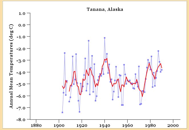
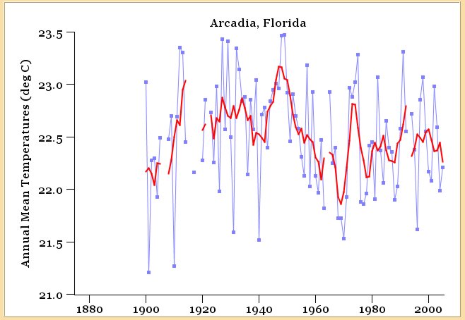
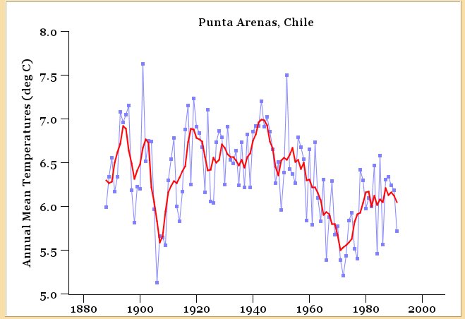
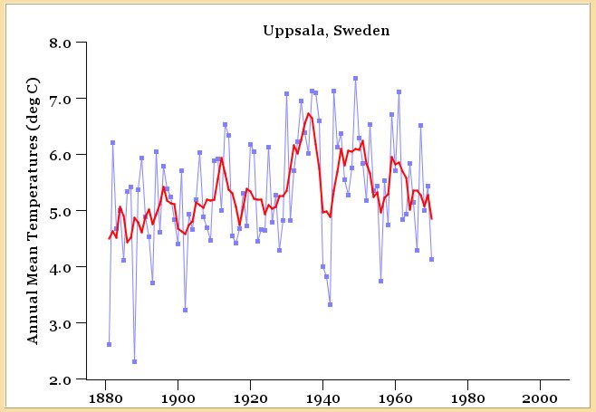
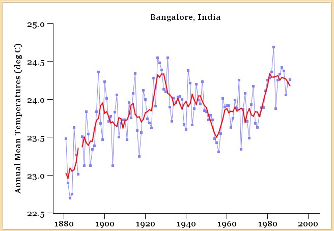
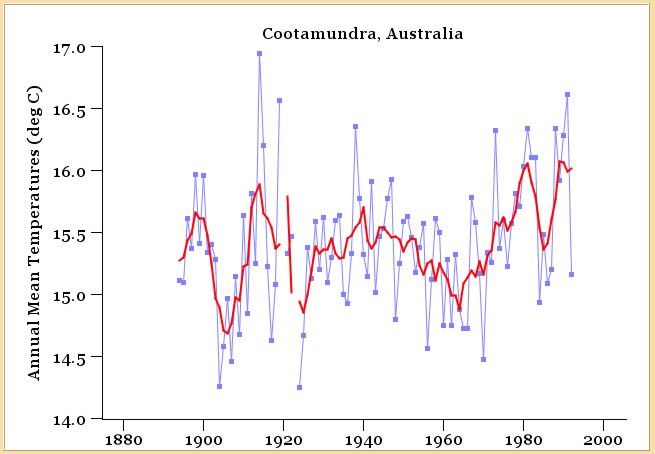
NASA and the Warmest Year (Michael Goodfellow, October 11, 2007) Back in August, 2007, there was a flurry of news items about how NASA had revised its temperature measurements and was now showing 1934 to be the hottest year on record, not 1998. The global warming story was one of steadily increasing temperatures, so this sounded very significant. A lot of the right wing blogs had a field day with it and made it sound like NASA couldn't get its math straight. James Hansen of NASA and other warming researchers replied that the revision was minor and didn't change the big picture at all. Curious about this, I followed a link in one of the articles to this page on the NASA site, which gave the actual numbers. Graphing these, you can see fairly clearly what's happening: 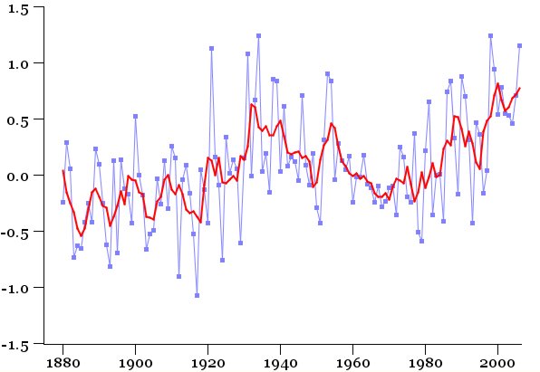 The numbers on the left are not straight temperature, but "degrees of anomaly" from a baseline temperature that has been declared "normal." The blue data is the NASA difference from normal for each year. The red data is smoothed by averaging 5 years at a time. You can see that there's a peak in the 1930's, then a drop into the 1970's, then another warming into the 1990's. Since there are two peaks, it's easy to change the overall ordering of "hottest years." Anything that drops the recent peak even a bit causes the 1930's years to become hottest. In the new ordering, there's a mix between 1930's years and 1990's years, because the two peaks are so similar. So on the one hand, the warming people are right that the revisions are minor. On the other hand, no one seemed interested in presenting the bigger picture. If temperatures had risen in the 1930's and then fallen again, why were researchers so sure that the recent rise was the beginning of long-term global warming? In some of the discussion, people seemed to be implying that the 1930's rise was limited to the continental U.S. (the "dust bowl" period), and so had nothing to do with the overall global warming trend. I thought that sounded reasonable and left it at that. Recently, I was asked about this issue by a friend and decided to write up what you've read so far as a short entry on my blog. However, I had lost the URL of the page with the data on it. Doing a search for it, I ran across a much fancier page on the NASA site that allows you to click on any weather station in their database and see the data for it. The page is here and I urge you to play with it if you are interested. Here are a few things worth noticing. First, the page has three small graphs at the top, indicating the number of years covered by each station, the number of stations, and the percent of the world covered by station data. 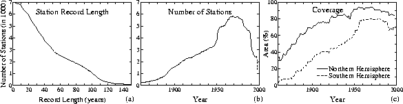 The left graph shows that most stations don't have as many years as you'd like. In fact, if you are interested in the 1930's, less than half of the stations have data back that far. I found the center graph to be shocking, since it shows that the number of stations has actually been dropping for the last 30 years! I'm assuming that these stations were all created for weather forecasting, and now that satellite data is available, they are being shut down. Still, with the whole world worried about global warming, it seems incredible that we'd let any sources of data disappear. I kind of doubt these are that expensive to maintain. The third graph shows coverage, and you could look at that and argue that coverage hasn't declined that much (although it has declined.) Then you note that "coverage" means within 1200km (745 miles) of a station. In fact, if you use another of their pages (go here) to plot coverage data, you get graphs like these for the 1930's: 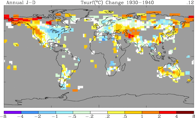 No ocean data was used here, but the gray areas over land show you areas that just weren't covered at all back then. Even today, the coverage of Africa isn't much better. The station data page is here, and you can click on a world map and get a list of all the nearby stations. Then pick a station to see the data as a graph. A link off that page gives you the data as a table which you can play with yourself. There's a discussion of stations on www.surfacestations.org that claims many of the stations are subject to "heat island" effects or have not been properly maintained. The NASA data has notes that data is "corrected" to account for these effects. I picked rural stations with 100 years of coverage, hoping to get reasonably clean data. Since I was thinking about the dust bowl and drought during the 1930's, I picked a station in Ellsworth, Kansas: 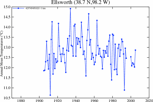 First, notice how jagged and noisy the data is. Temperatures do vary quite a bit from year to year. Second, notice it shows a peak around 1940, with falling temperatures since. Surprisingly to me, it does not show a warming trend in the 1990s. I then looked at the tabular data, and I can see some of the issues people have talked about with the NASA processing. In addition to the problem of correcting them for urban heat islands, there's the problem of missing data. Here's a bit of the table for Ellsworth: I wanted to smooth these graphs a bit, since the data varies so much that I couldn't really pick out the trends. I wrote a program to take the data off their tables and display it with a smoothed version as well. Here's the Ellsworth data with my graph. Next to it, the data for Larned, Kansas, only 63 miles away. 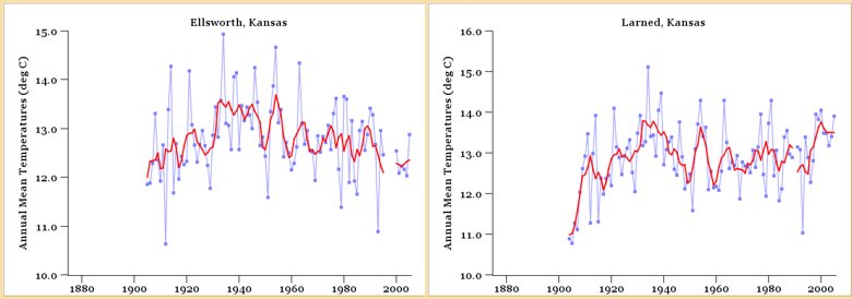 Notice they both show peaks around 1940. After that, the Ellsworth data trends down and doesn't show much of a peak in the 1990's (there are those missing years though.) The Larned data shows a peak in the 1990's and is similar to the U.S. average data I started with above. Then I started to poke around more broadly. Is the 1940's peak only visible in the U.S. data, or is it worldwide? I've included six graphs below, from north to south (left to right), in the Americas (top set) and in Europe (bottom set.) Click on each graph to see a larger version. In all of these graphs, you can clearly make out something like a peak in the 1930-1940 range.
I'm picking and choosing my locations here. Poking around, many of the sites outside the U.S. don't have very complete data. I'm mostly using the "rural" sites that have data over most of the 20th century, and no big gaps. Still, you can find a lot of variation in these sites. Many show the trends you see in these six graphs. Others show clear uptrends for the whole range of dates. But still others show a clear cooling trend over the whole range of dates! Coastal locations in the U.S. have a much less pronounced peak in the 1940's. But from these examples, you can clearly find some kind of peak most places you look around the world. The 1940's warming does not seem to be restricted to the continental U.S.. Finally, let me say a word about one of their other graphs. It shows the warming trend for the entire world. You can change the parameters though and get many different graphs out of it. Unfortunately, they have picked some odd defaults. The default graph compares the month of August, 2007, with the average of August readings, 1951 to 1980. This produces a really dramatic looking graph with lots of red, indicating several degrees of warming. They also default to "1200km smoothing radius", which makes it look like data covers the entire world (it also makes the red patches bigger.) That graph looks like this: 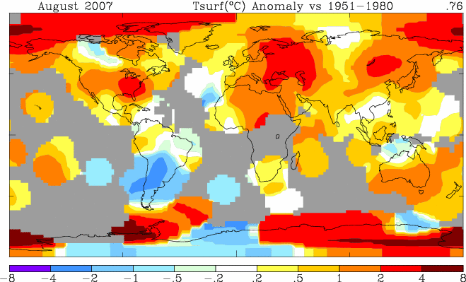 There are three problems here. First, as I mention, 1200km makes the data look better than it is. Using 250km, you see how sparse the data really is around the equator. Second, using a single month in 2007 as your comparison is meaningless, given how much temperature varies from year to year. And most importantly, using a base period from 1951 to 1980 includes the cooling trend of the 1970's, but not the warming of the 1930's. If instead we graph a comparison of 1996-2006 against 1930-1940, and use the full year averages, with less smoothing, you get the graph below. Not quite as alarming! 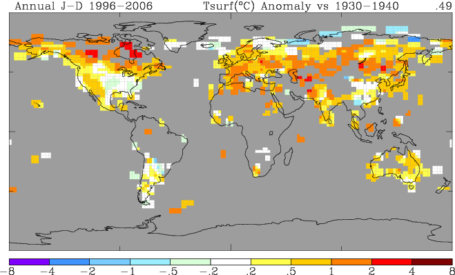 After all this playing with the data, it's hard to come to a neat summary. The data is much messier, more incomplete and more variable than I had realized. There are individual stations where the data would convince you the world is heating dramatically, and other stations that look like an ice age is coming on. And still more stations where nothing particular happens for 100 years of weather! I don't know how anyone looks at all this and comes to a firm, bet-a-trillion-dollars conclusion that the climate is definitely warming. Looking at the NASA site just reinforces for me how dependent this whole warming argument is on the predictions of computer models, and not on simple extrapolation from the climate data. Michael Goodfellow blogs at Free The Memes! For more on a wide array of other topics, please visit the oftwominds.com weblog. HTML, format and art copyright © 2007 Charles Hugh Smith, copyright to text and all other content in the above work is held by the author of the essay as of the publication date listed above. All rights reserved in all media. The views of the contributor authors are their own, and do not reflect the views of Charles Hugh Smith. All errors and errors of omission in the above essay are the sole responsibility of the essay's author. The writer(s) would be honored if you linked this Readers Journal essay to your site, or printed a copy for your own use. |
||||||||
| Readers Journal weblog/wEssays | home |